In screen printing there are different types of inks, finishes, and techniques. Foil and Metallic finishes are a good way to make your print stand out. These types of screen printing techniques add textures and vibrancy to apparel prints as well as flat stock prints such as posters. We’ll take you into the ways these techniques are applied and show you examples.
What is Foil Screen Printing?
Foil Screen Printing is similar to traditional screen printing but an adhesive glue ink is used instead of plastisol inks. The foil is cut in squares off of a large roll of foil. It is then placed over the glue adhesive print and heat pressed. The heat press activates the glue adhesive and grabs onto the foil. After the print cools, the foil sheet is pulled off and the excess foil is peeled off of the garment.
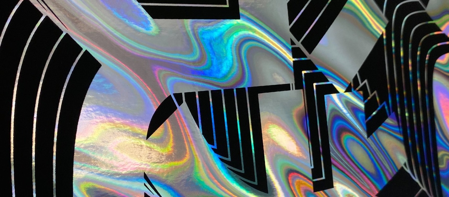
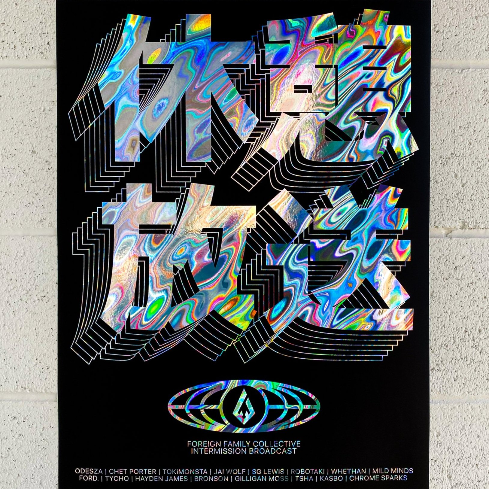
Foil works great for simple accents to a design as well as a loud bold statement. Foil prints give a mirror like effect to your screen prints and really shine when any light hits them.
There are a few different types of foils, holographic foils gives the most dynamic effect as it reflects light creating a variety of different colors as seen on the example image.
Foil printing is a premium screen printing method so you need to make sure you’re only working with true screen printing experts like us!
Check Out How To Screen Print Foil Transfers with Wilflex HD Clear Foil Adhesive
Pros
No set-up costs
Can be used on all types of products/garments
Great for letters and numbers
Fast process
Perfect for single color designs
Perfect for sports garments
Cons
Material isn’t breathable
Durability not as good
Struggle with gradient designs
What is Metallic Screen Printing?

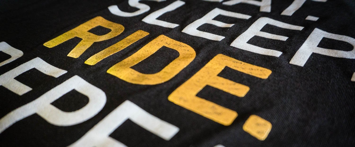
Unlike printing with foil, to achieve a shiny metallic print you don’t need an overlay treatment or transfer because there are metallic inks that are used in the same way plastisol inks are utilized. The most used metallic inks are silver and gold and give off a shiny but non-reflective finish. Metallic inks work best when there are no small details to fill as the ink is a bit thicker than normal.
Metallic inks not only look nice, they will also help take your marketing materials to the next level by providing a more “expensive” look. When you incorporate metallic inks, you create a shiny and glossy effect that will make your full color postcard, business card, catalog or brochure stand out from the pack.
Pros
Smoother print finish than glitter inks
Plastisol ink based so the cured inks are very robust and long lasting
Available in a surprising amount of different colors
Cons
Not good for fine detailed artwork
Plastisol based metallic inks have a rubbery hand feel
List Of Metallic Inks:
Pantone 873 – Metallic Gold
Pantone 877 – Metallic Silver
Pantone 8003 – Metallic Platinum
Pantone 8021 – Metallic Champagne Gold
Pantone 8062 – Metallic Pink
Pantone 8100 – Metallic Purple
Pantone 8201 – Metallic Blue
Pantone 8281 – Metallic Green
Pantone 8381 – Metallic Moss
How To Design fOR fOIL pRINTS AND Metallic Inks
If you’re thinking about using metallic ink on your next print project, it’s always best to talk to your printer first to make sure they have experience with this type of ink. You may also want to ask to see samples of projects using metallic ink.
1. Choose your apparel blanks with color pairings in mind
While starting with a well-chosen garment is important for every custom apparel project, the look of unconventional and eye-catching metallics will change greatly with the blank you choose.
Muted colors like olives and soft earth tones will tone down and refine metallics, while jewel tones - like emerald, deep reds and royal purples or blues - will create a flashier look.
2. Consider surface area for an impactful design
One of the ways to get the most impact from your metallic embellishment is to incorporate it into a larger surface area, which will best catch the light and give your design the most noticeable sheen.
On the reverse, incorporating metallics in smaller areas or a design with thinner lines can bring an ink that’s admittedly not for the faint of heart to a more approachable level. Make sure to consult your printer.
3. Use metallics as an accent with other inks
Not every design needs to go full-on with foils or metallics, all of these specialty services can be paired with standard inks.
Use metallics and Foils to highlight a specific aspect of your design, whether it’s a word you’d like to emphasize or an element of your graphic you want to really stand out.
4. Typography heavy tee
A popular and easy way to include metallics and foils is with text. The above tips can be equally helpful in designing your typography tees.
To emphasize the sheen of your specialty ink, choose a bold, blocky font and a larger text size. To include metallics in a less overt way, use a thinner font or combine inks to highlight a specific word or letter.
Don’t be afraid to play with positive and negative space - A knockout (or reverse text) design is a great way to increase surface area while using the color of your apparel blank to your advantage.
Author: Irene Floridia - Content Creator
Follow us on Instagram and Facebook!
For FAQ, check out our site!
For any inquiries, send us a message!
OR
send us an e-mail at quotes@familyindustriesla.com