
design by Coco Nella
Designing a t-shirt can be a daunting task, some will hire a designer and some will take the DIY route. Regardless of how you decide to do it, it’s important that your design translates well on a t-shirt and for this reason, we came up with a checklist for you to follow and make sure you’re on the right track.
Design Checklist

1. What’s your goal?
Before starting your design, it’s important to understand what you are trying to accomplish with your t-shirt. What is your primary goal? Are you trying to raise money for a cause? Are you trying to gain recognition as a new clothing brand? or are you simply trying to sell as many t-shirts as possible? Maybe you’re simply creating a shirt for your team at work or for your family reunion. Establishing a goal will help you narrow down your design and pricing choices.

2. Brainstorm
Brainstorming will help you determine the colors, the fonts, words, and imagery for your t-shirt design. It’s crucial to have a list of guidelines around your design to have a starting point when you begin your creative process. It will also help you make sure you include everything you need, especially if you are designing apparel for a specific event or cause.

3. Gather inspiration
This is the fun part! start googling images or looking through Instagram or Pinterest for inspirational images that best fit the aesthetic and vibe you are going for. There are also tons of books containing great and famous designs from now and past decades that may be helpful to you if you’re trying to create something that is unique to this time period.
Here are some important details to consider once you have settled on a design:
Size
The size of your graphic should be based on the design, and the properties of the garment to be printed. Depending on the shape of the design, it can look much bigger than what it should. For example, square or circular shapes tend to look better when they are sized smaller than standard.
Some may print the design on a sheet of paper and hold it up to the t-shirt to ensure the sizing is right. Others may use an online t-shirt mock-up generator.
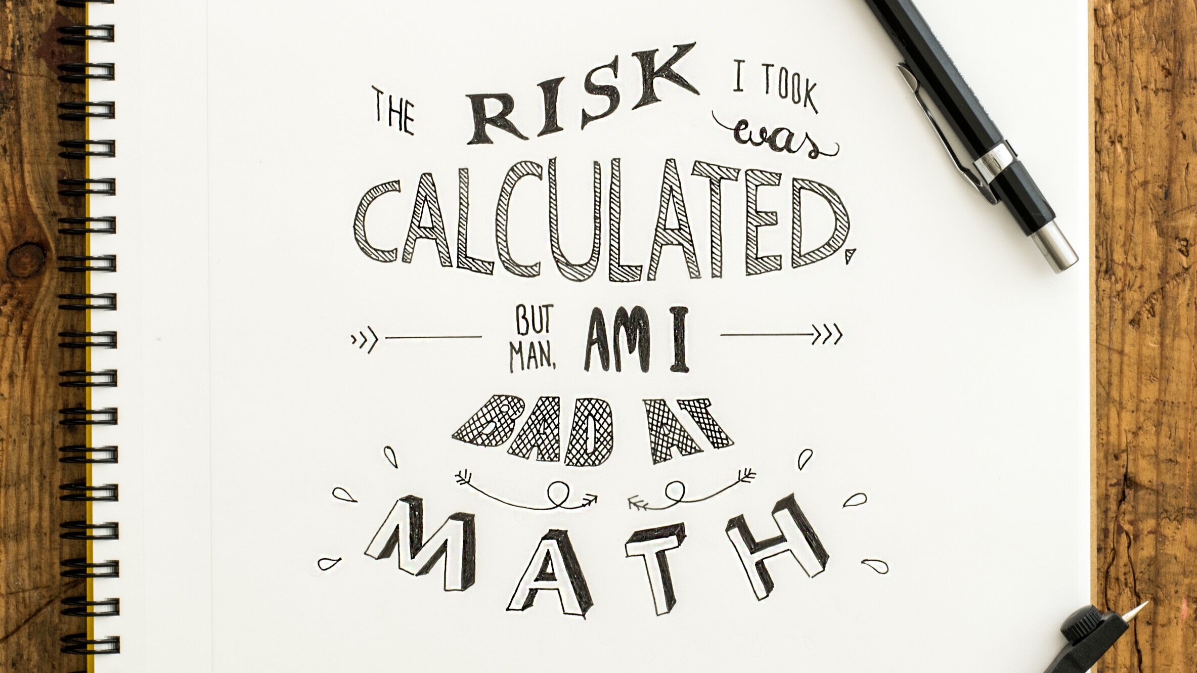
Font
Some fonts look better than others and if this is an integral part of your design, you will need to make sure it translates well on a t-shirt or sweatshirt. If you are struggling with finding the right way to properly visually represent your brand, typography is a great way to start, Typography can become a voice of design.
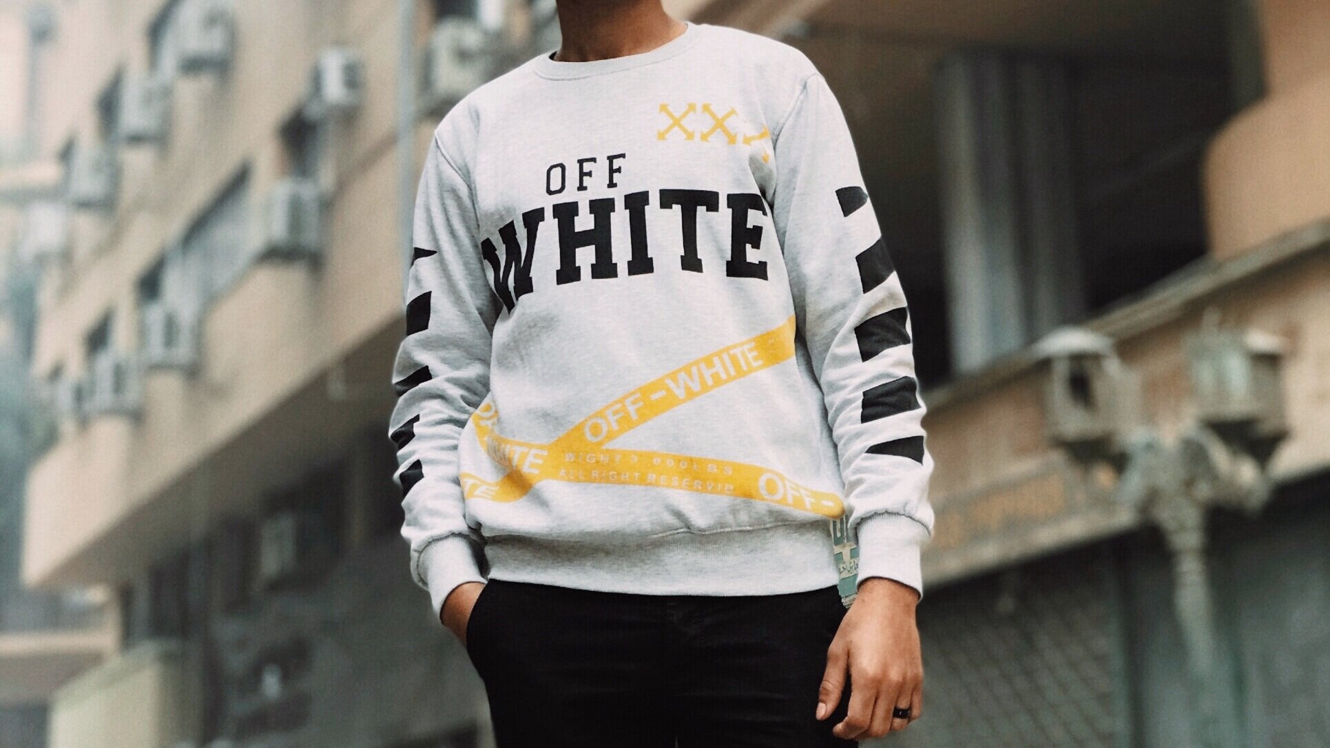
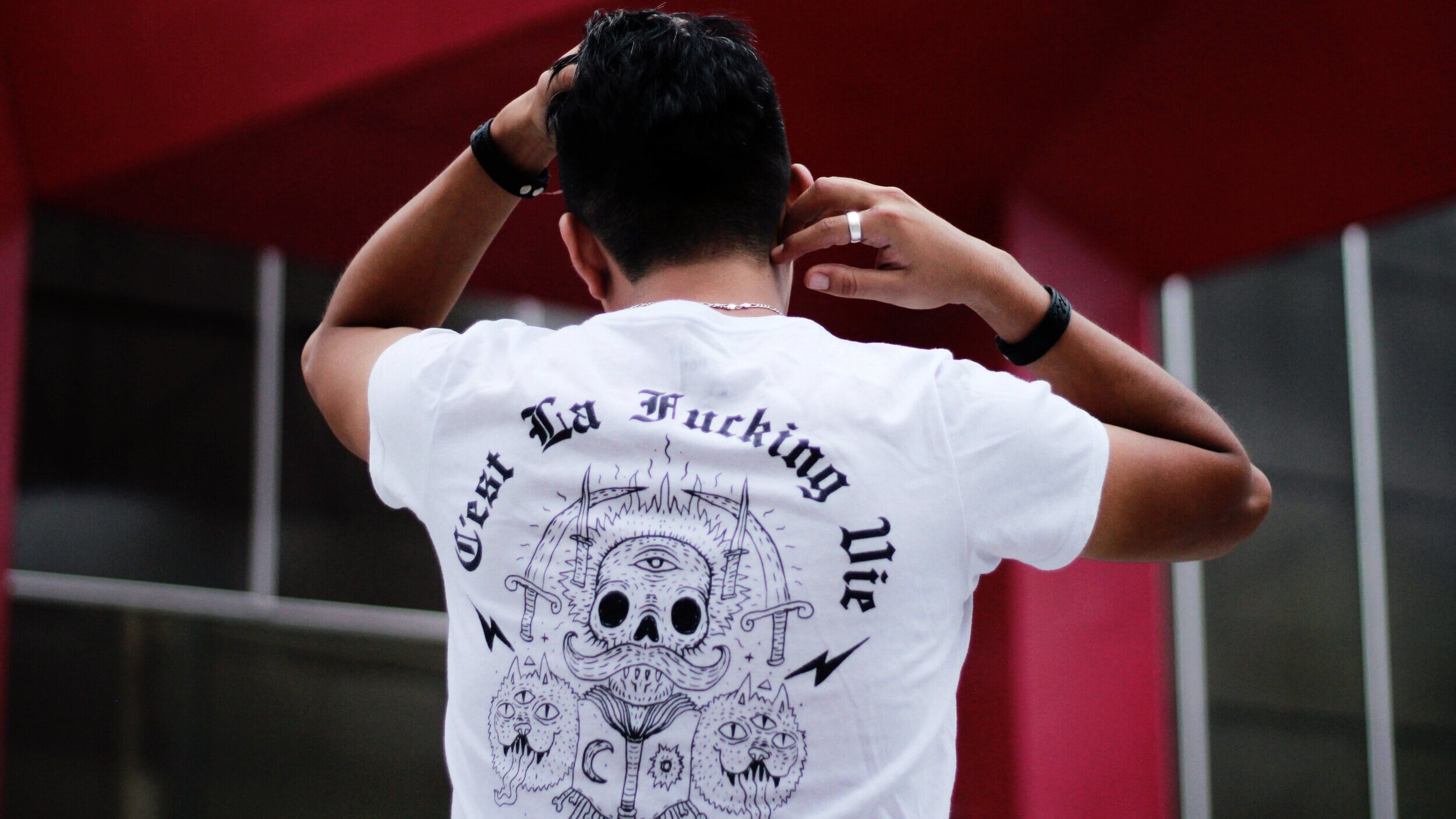
Placement
With methods such as screen printing, there are a few options for placement. The most common areas are the center of the chest, left chest, full front, oversize front, upper back, center back, and full back. The placement, most of the time, will be determined by the design, the shape, or the purpose. If it’s important for the image or design to be visible, a center chest placement may be ideal. Other less common placements are the sleeves, sides, or back of the neck, which are increasingly becoming more popular among streetwear clothing brands.

Common Mistakes To Avoid
While you may have a great design ready to print, there are common mistakes people make when they are ordering t-shirts to be printed. Here an outline of some of those mistakes to avoid:
Sizing
This is the most common and avoidable mistake people make when submitting a design to a print shop. The size of the artwork is important and vital as well as figuring out the cut of the t-shirt that the artwork will be printed on.
Placement
This may seem straight forward, however, one common placement mistake is printing the design at belly level which is not flattering. Generally, when the artwork is submitted, the printer will advise on placement and adjust your file to the best fit. Alternative placements such as sleeves or sides are possible and your printer should be able to help you with such requests to ensure the design will translate properly.
Typography
There are millions of font types, some better than others and not all will work for a t-shirt design. typography is the art of typesetting or arranging type in a way that makes sense, along with choosing typefaces (fonts) making sure that the spacing is correct, and the way it interacts with the graphic elements is aesthetically pleasing to the eye. Your font choice can say a lot about the way your design is received, and convey certain ideas or evoke emotions that may not be intentional. A good rule of thumb to ensuring your design looks good is to never use more than 3 different fonts in one design. Check this site to get a crash course in typography!
Composition
Composition in terms of design is everything. Every design has elements that are arranged in relation to each other, and this relation is what makes up the overall composition. Some will say that composition is in the eye of the beholder, but there are certain rules to follow when creating a design. A typical mistake would be the spacing or the entire design could be off-balance, drawing the eye to the wrong thing. Here are a few resources to help you with composition.
Image quality
Nobody wants a blurry design on their t-shirt and this is one big mistake people often make when they submit a file to the printer. To ensure your design or image is big enough and is high-quality, check the resolution (pixels). Ideally, images should be 200dpi or higher to guarantee a clear and detailed print.
Contrast
Low contrast can lead to very hard to see designs against specific color t-shirts. If the contrast is off, your design won’t shine. So, what is contrast? It’s the degree of visual difference between the darker and lighter parts of an image, or the way shades of colors correspond to each other. The strongest contrast is between colors is black-on-white or vice versa. And of course, bright colors on a dark background are going to also be high contrast.
Details
Fine details, small text, or very thin fonts can be difficult to discern on printed t-shirts. What might look good in black and white on paper or even on your high-quality phone screen can be hard or almost impossible to read on a t-shirt. Your design should have thick lines with also bold font or font that is big enough to translate well on a shirt.
Borders
This mistake often happens when the design is a photograph. Designs that have a border can often look boring or cheap, that’s why it’s advised to take out any blank border from an image or design. Removing the border can make a huge difference and make the t-shirt more appealing to your customers. You may remove the background using photoshop, or if you don’t have photoshop, our team at Family Industries can help you.
Author: Irene Floridia - Content Creator
Family Industries has experts standing by ready to help you with any of these roadblocks. We offer graphic design help and we also consult on print options. Click Here to Contact Us!